Hackathon Project
Stockvolution
Designing a No-Code Algo-Trading Experience from the Ground Up
UX/UI
Research
Prototyping
Product


The Starting Point
We joined the hackathon late and were handed a half-built trading platform - at least, that’s what it was meant to be.
Originally created by one of the mentors’ students, the platform had some backend logic and a rough UI, but no documentation, no clear purpose, and no product direction.
The dev team spent days just trying to get the algorithm running. The frontend was barely usable - no structure, no guidance, and no idea what the user was expected to do.
It wasn’t a product. It was a raw experiment. And our job was to turn it into something people could actually use.

Defining the Product
With no product manager and no documentation, our first job was to ask the questions no one had answered yet:
What’s actually happening inside the algorithm, and how do we comunicate it
What kind of experience should this be - website?
plugin? desktop software?
What problem is this platform actually solving?
Who are the users? What are their goals, fears, and limitations?


Understanding the users
Once we understood what the platform could do, we shifted focus to the people we were building it for. We identified two distinct user types - our Ideal Customer Profiles (ICPs) - each with different levels of experience and expectations.
IntermediatesThey’ve dabbled in trading and want smarter tools, without writing code.They need:
- Flexibility
- Reliable metrics
- Control
- Insight over friction
This structure gave beginners the reassurance of a guided, step-by-step flow, while allowing intermediates to move efficiently from setup to results without distractions.


Mapping the Flow
Once we understood the product and our users, we examined the flow we were given:


0.1
Select tickers and personal preferences
0.2
Generate a custom strategy
0.3
Review performance metrics
It was simple on paper - but overly so. There was no guidance, no context, and no sense of what came next. For beginners, it lacked reassurance and explanation. For more experienced users, it felt too barebones, offering no room to explore or refine.
This flow outlined the core idea, but it lacked the guidance and context required to make it usable and trustworthy.

A Clearer Path Forward
With the original flow as our baseline, we redesigned the main experience into a clear, guided journey focused on reducing friction and building user confidence.

0.1
Landing & Login

0.2
Create New Strategy
0.3
Select Tickers & Preferences
0.4
Generate Strategy
0.7
Upgrade Options


0.6
Simulate or Go Live
0.5
View Results
- Landing & Login – Start with a simple, direct entry point and require sign-in at the right moment, avoiding unnecessary barriers upfront.
- Create New Strategy – Initiate a new strategy with clear labelling and an obvious call to action.
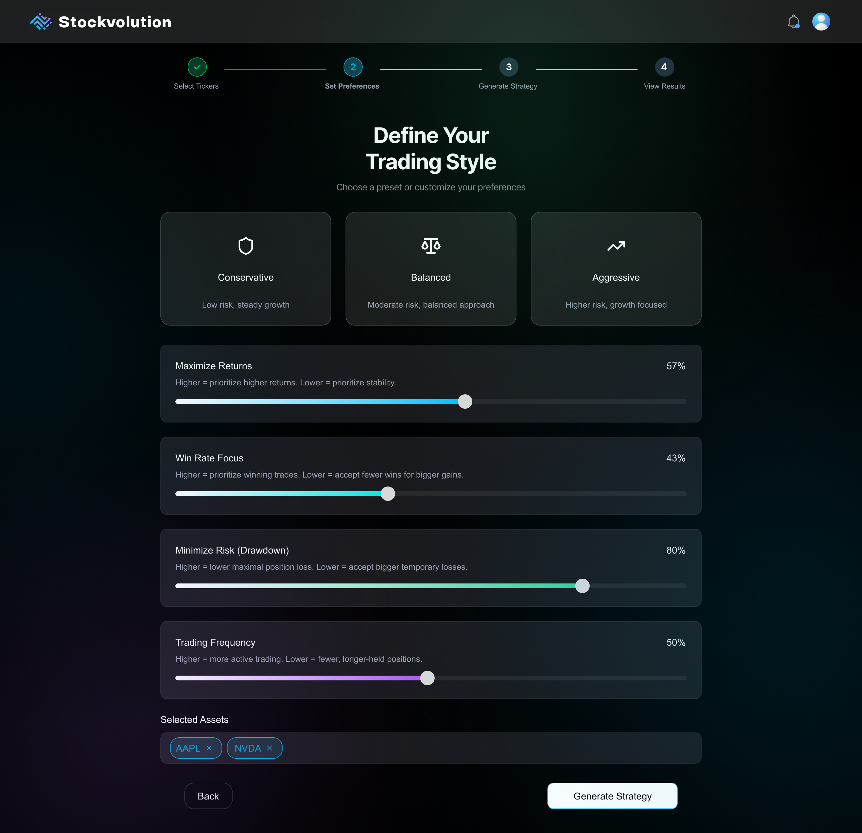
- Select Tickers & Preferences – Choose up to 5 tickers and define preferences like risk or reward using intuitive sliders and presets.
- Generate Strategy – One click runs the genetic algorithm with no extra complexity.
- View Results – Present visual metrics and simplified explanations to help users quickly understand outcomes.
- Simulate or Go Live – Safely test with a virtual wallet or connect a broker account when ready.
- Upgrade Options – Unlock advanced features like saving or comparing strategies when upgrading.
This structure gave beginners the reassurance of a guided, step-by-step flow, while allowing intermediates to move efficiently from setup to results without distractions.

Interface Audit
Before moving forward with design, we took a hard look at the original interface. What we found made it clear why users would struggle:
- No hierarchy or structure Elements felt scattered, with no visual cues for priority or next steps.
- Unclear terminologyTechnical labels like “Drawdown Period Weight” appeared without explanation, intimidating for beginners.
- High cognitive loadUsers faced raw data and sliders without context, forcing them to make uninformed choices.
- No onboarding or guidanceThere were no hints, tooltips, or instructions to help new users navigate.
- Barebones visualsThe design felt like a developer demo rather than a polished, trustworthy product.
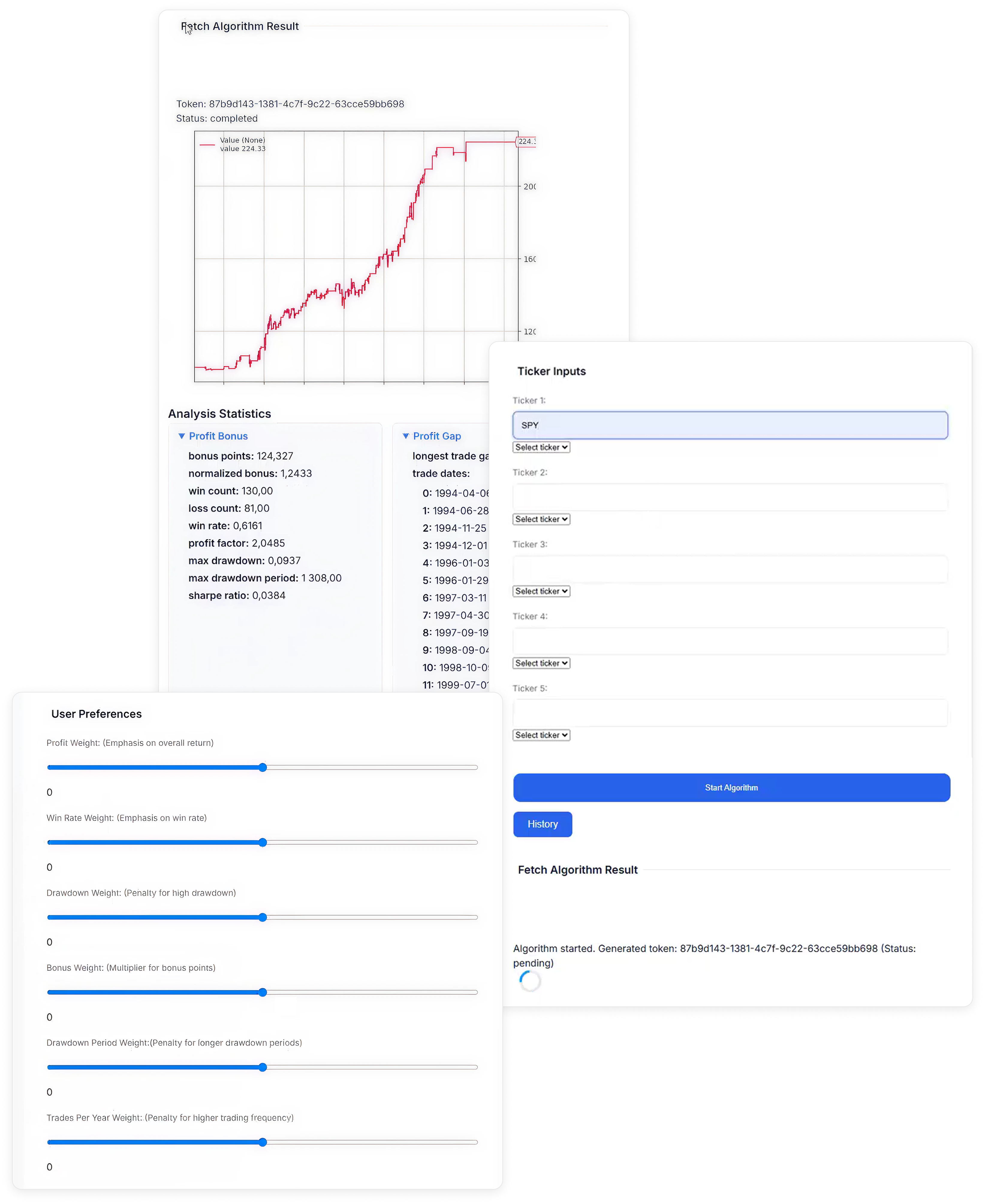
These issues reinforced our earlier insights: we needed to design for clarity first. Reducing cognitive friction and guiding users step by step became our top priority.


AI-Driven Kickstart
Given our two-week timeline, we needed a way to move fast without sacrificing structure. Instead of starting from a blank canvas, I used an AI design tool to generate a coded base UI directly from our defined flow and UX principles.
I created a detailed prompt that included:
- The full UX flow – Each step mapped clearly from onboarding to results.
- Component requirements – Sliders, charts, tables, and CTAs tailored to the strategy-building process.
- Visual guidelines – Clean, fintech-inspired design with a focus on clarity and accessibility.
- Onboarding logic – Contextual guidance baked in to support beginners without cluttering the UI.
This approach gave us a coded starting point we could build on, saving days of front-end work and letting us focus our energy where it mattered most: refining the experience.
I created a detailed prompt that included:
Given our two-week timeline, we needed a way to move fast without sacrificing structure. Instead of starting from a blank canvas, I used an AI design tool to generate a coded base UI directly from our defined flow and UX principles.
I created a detailed prompt that included:
- The full UX flow – Each step mapped clearly from onboarding to results.
- Component requirements – Sliders, charts, tables, and CTAs tailored to the strategy-building process.
- Visual guidelines – Clean, fintech-inspired design with a focus on clarity and accessibility.
- Onboarding logic – Contextual guidance baked in to support beginners without cluttering the UI.
This approach gave us a coded starting point we could build on, saving days of front-end work and letting us focus our energy where it mattered most: refining the experience.


Attach

This approach gave us a coded starting point we could build on, saving days of front-end work and letting us focus our energy where it mattered most: refining the experience.

Tightening the Experience
I ran a UX audit of every component, looking for inconsistencies, usability issues, and visual misalignments. Some fixes were small enough to describe directly to the dev. Others required redesigning components in Figma and documenting expected behaviors.
This process created a healthy loop:
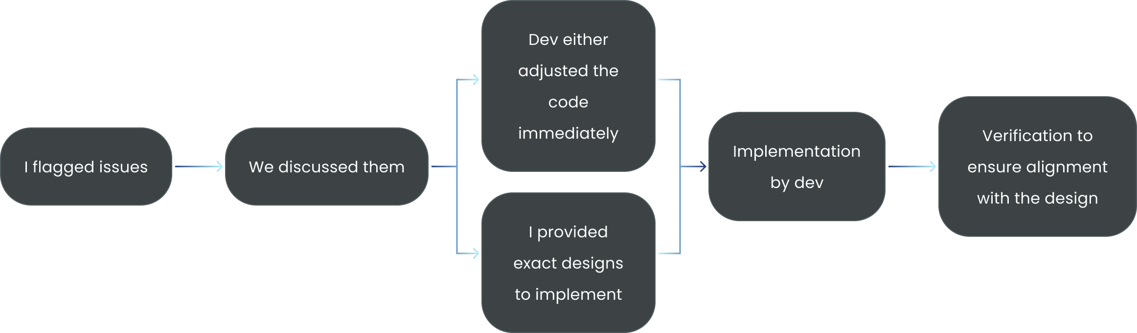
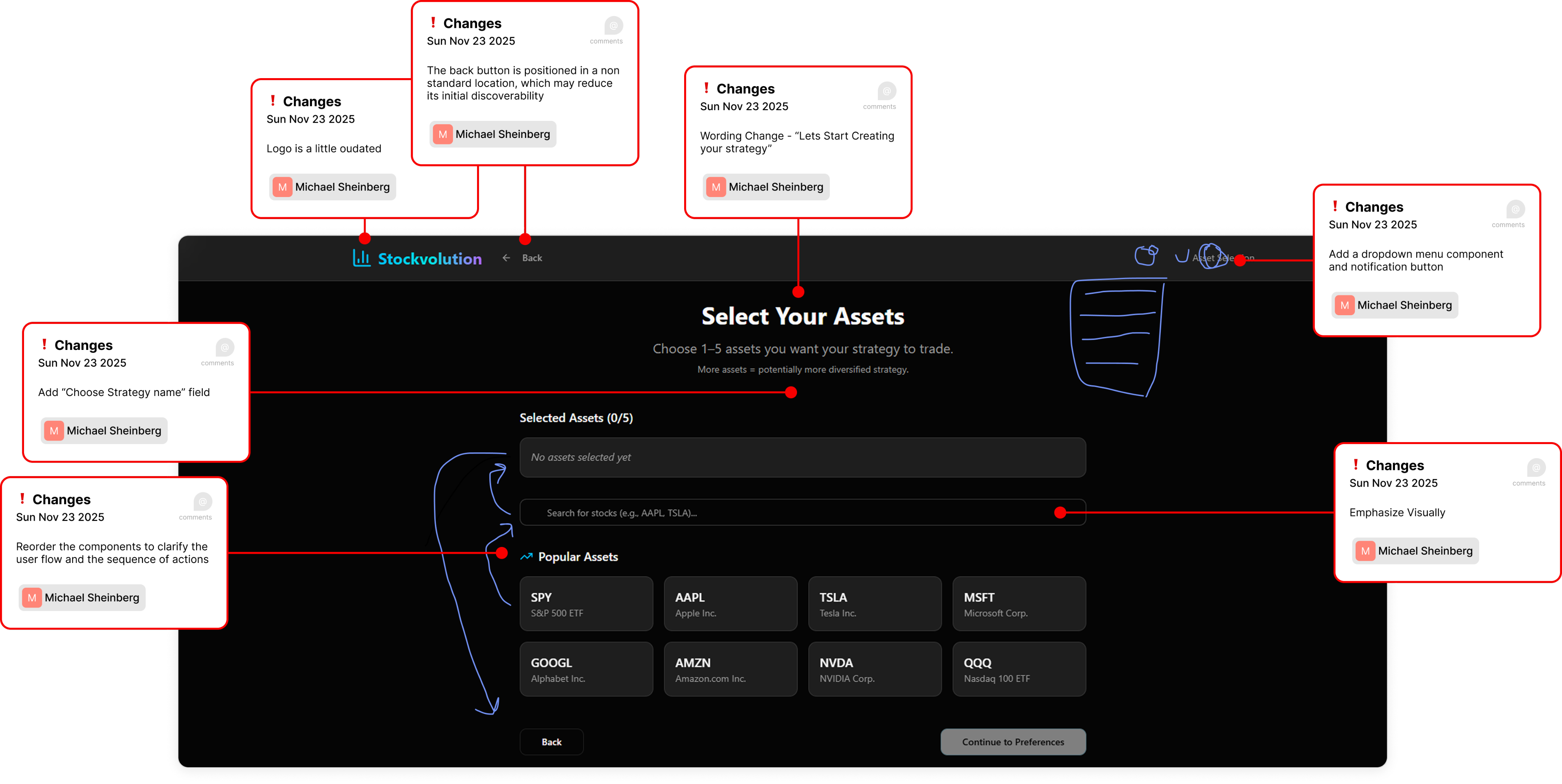
*An example of the issues flagging stage
Together, we shaped something functional into something polished.

The Final Product
The result was a polished, user-focused platform that delivered on our original vision:
making algo-trading approachable for beginners while still powerful enough for intermediates.
Takeaways
This project pushed me to balance speed, clarity, and collaboration under real constraints. My biggest takeaways:
- Clarity comes first. Before designing, I learned the importance of asking the right questions to truly understand the product, its users, and its logic.
- Designing for beginners shapes everything. Building trust through simplicity and guidance not only helps novices but improves usability for all.
- AI can accelerate, not replace. Used strategically, AI sped up our workflow and freed us to focus on high-value refinements.
- Tight designer–developer loops are invaluable. Iterating side by side with a clear issue-tracking workflow bridged the gap between design intent and implementation.
- Good UX is translation. Turning technical complexity into an accessible, human experience is where design adds its most value.
This wasn’t just about creating screens — it was about shaping an early-stage idea into a usable product, and doing it fast, without losing focus on the user.
Would you like me to now compile all sections into one cohesive case study draft ready for portfolio formatting?
Ask ChatGPT


Hackathon Project
Stockvolution
Designing a No-Code Algo-Trading Experience from the Ground Up
UX/UI
Research
Prototyping
Product

The Starting Point
We joined the hackathon late and were handed a half-built trading platform - at least, that’s what it was meant to be.
Originally created by one of the mentors’ students, the platform had some backend logic and a rough UI, but no documentation, no clear purpose, and no product direction.
The dev team spent days just trying to get the algorithm running. The frontend was barely usable - no structure, no guidance, and no idea what the user was expected to do.
It wasn’t a product. It was a raw experiment. And our job was to turn it into something people could actually use.

Defining the Product
With no product manager and no documentation, our first job was to ask the questions no one had answered yet:
What problem is this platform actually solving?
Who are the users? What are their goals, fears, and limitations?
What’s actually happening inside the algorithm, and how do we communicate it with the users
What kind of user interface should this be - website?
plugin? desktop software?

Understanding the users
Once we understood what the platform could do, we shifted focus to the people we were building it for. We identified two distinct user types - our Ideal Customer Profiles (ICPs) - each with different levels of experience and expectations.
BeginnersThey’re curious about algorithmic trading but easily overwhelmed.They need:
- Approachable UI
- Jargon-free
- Risk-free testing
- Confidence and control
IntermediatesThey’ve dabbled in trading and want smarter tools, without writing code.They need:
- Flexibility
- Reliable metrics
- Control
- Insight over friction
This distinction helped us understand the balance needed between
simplicity and depth - keeping the core experience beginner-friendly while allowing more advanced users to go deeper when ready.


Mapping the Flow
Once we understood the product and our users, we examined the flow we were given:
0.1
Select tickers and personal preferences
0.2
Generate a custom strategy
0.3
Review performance metrics
It was simple on paper - but overly so. There was no guidance, no context, and no sense of what came next. For beginners, it lacked reassurance and explanation. For more experienced users, it felt too barebones, offering no room to explore or refine.
This flow outlined the core idea, but it lacked the guidance and context required to make it usable and trustworthy.

A Clearer Path Forward
With the original flow as our baseline, we redesigned the main experience into a clear, guided journey focused on reducing friction and building user confidence.
0.1
Landing & Login
0.2
Create New Strategy
0.3
Select Tickers & Preferences
0.4
Generate Strategy
0.7
Upgrade Options
0.6
Simulate or Go Live
0.5
View Results
- Landing & Login – Start with a simple, direct entry point and require sign-in at the right moment, avoiding unnecessary barriers upfront.
- Create New Strategy – Initiate a new strategy with clear labelling and an obvious call to action.
- Select Tickers & Preferences – Choose up to 5 tickers and define preferences like risk or reward using intuitive sliders and presets.
- Generate Strategy – One click runs the genetic algorithm with no extra complexity.
- View Results – Present visual metrics and simplified explanations to help users quickly understand outcomes.
- Simulate or Go Live – Safely test with a virtual wallet or connect a broker account when ready.
- Upgrade Options – Unlock advanced features like saving or comparing strategies when upgrading.
This structure gave beginners the reassurance of a guided, step-by-step flow, while allowing intermediates to move efficiently from setup to results without distractions.

Interface Audit
Before moving forward with design, we took a hard look at the original interface. What we found made it clear why users would struggle:
- No hierarchy or structure Elements felt scattered, with no visual cues for priority or next steps.
- Unclear terminologyTechnical labels like “Drawdown Period Weight” appeared without explanation, intimidating for beginners.
- High cognitive loadUsers faced raw data and sliders without context, forcing them to make uninformed choices.
- No onboarding or guidanceThere were no hints, tooltips, or instructions to help new users navigate.
- Barebones visualsThe design felt like a developer demo rather than a polished, trustworthy product.
These issues reinforced our earlier insights: we needed to design for clarity first. Reducing cognitive friction and guiding users step by step became our top priority.
AI-Driven Kickstart
Given our two-week timeline, we needed a way to move fast without sacrificing structure. Instead of starting from a blank canvas, I used an AI design tool to generate a coded base UI directly from our defined flow and UX principles.
I created a detailed prompt that included:
- The full UX flowEach step mapped clearly from onboarding to results.
- Component requirementsSliders, charts, tables, and CTAs tailored to the strategy-building process.
- Visual guidelinesClean, fintech-inspired design with a focus on clarity and accessibility.
- Onboarding logicContextual guidance baked in to support beginners without cluttering the UI.

Attach

This approach gave us a coded starting point we could build on, saving days of front-end work and letting us focus our energy where it mattered most: refining the experience.

Tightening the Experience
I ran a UX audit of the AI-generated design, reviewing every component for inconsistencies, usability issues, and visual misalignments. Some fixes were small enough to describe directly to the developer. Others required redesigning components in Figma and documenting expected behaviors.
This process created a healthy loop:

*An example of the issues flagging stage
Together, we shaped something functional into something polished.


The Final Product
This section reviews the final UX and UI, stage by stage. Each screen was built to reduce friction, guide users, and balance clarity with depth. Some components were generated using AI design tools, but every element was intentionally kept, tweaked, deleted, or redesigned based on clear rationale and user-focused decisions.

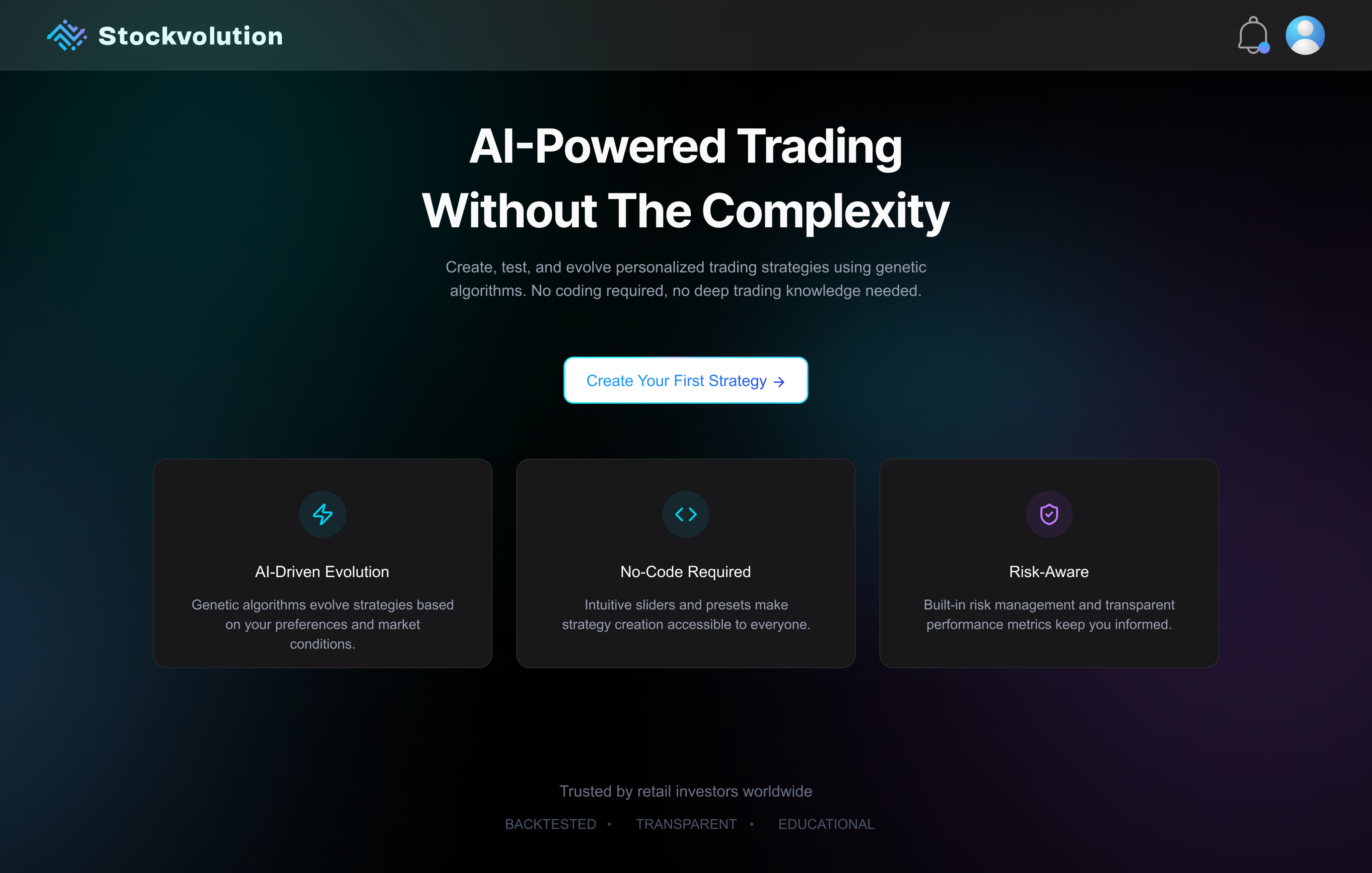
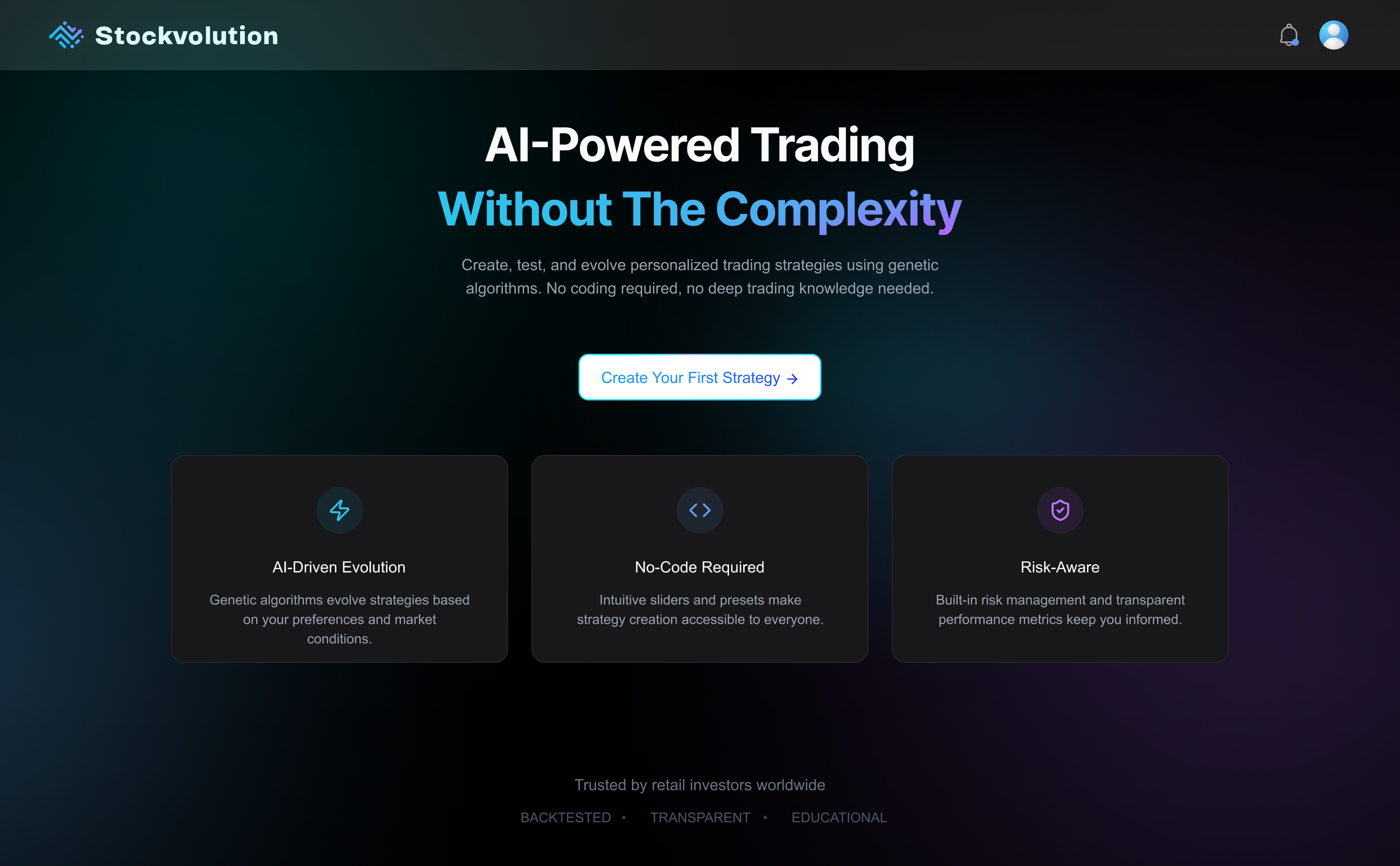
Landing Page
- The homepage balances credibility and clarity, immediately introducing Stockvolution’s value.
- The “Create Your Strategy” CTA anchors users in a structured and goal-oriented experience.
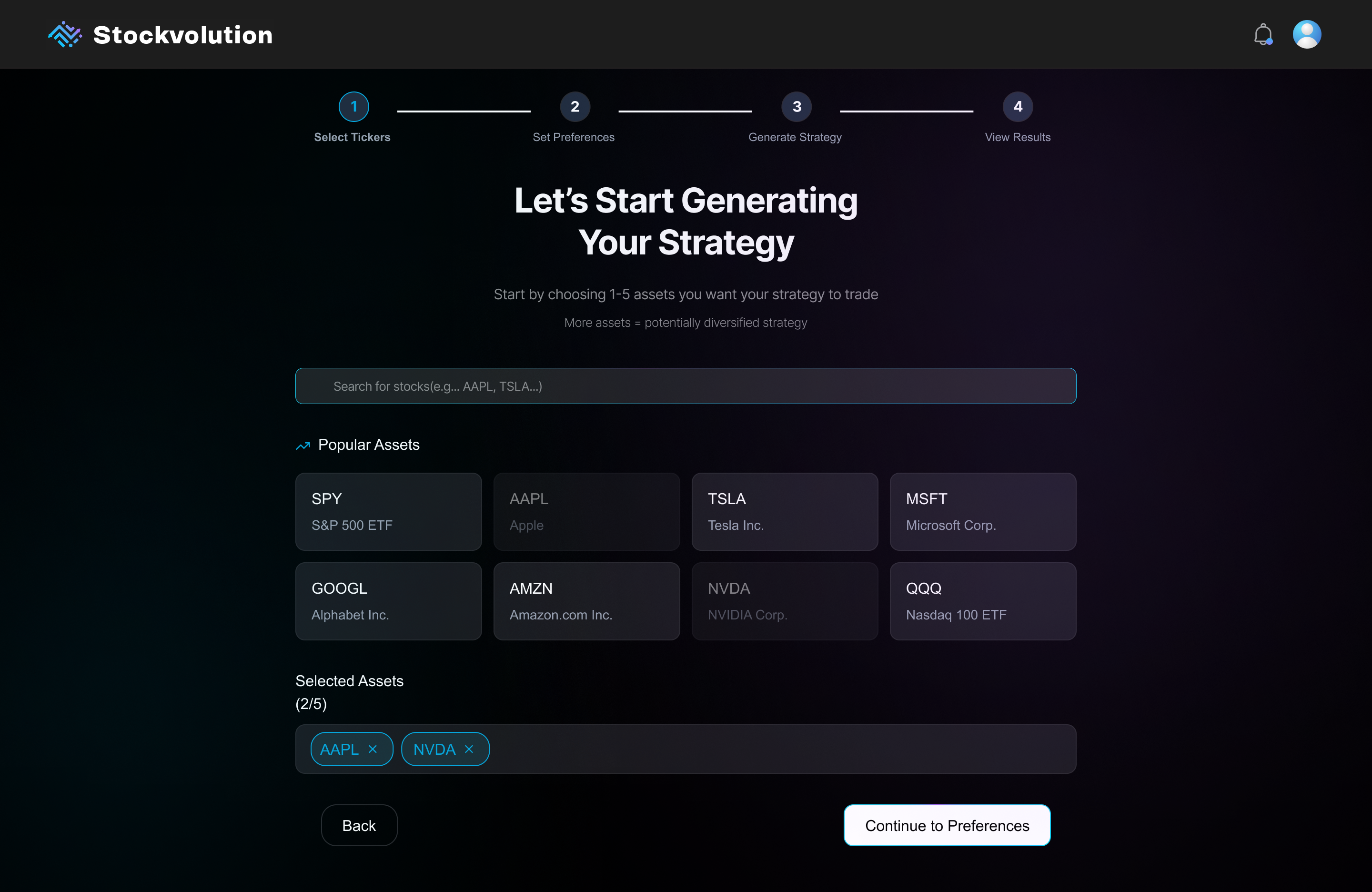
Asset Selection
- A visible stepper from start to finish creates certainty and orients the user within the process.
- Quick-pick “popular asset” cards placed just below the search bar reduce friction and support fast, confident decisions, especially for beginners.
Define Preferences
- Quick-start presets (Conservative / Balanced / Aggressive) help users make fast, confident decisions without needing deep financial knowledge.
- Custom slider controls allow fine-tuning. Each is paired with concise text that clearly explains how it affects the resulting strategy.
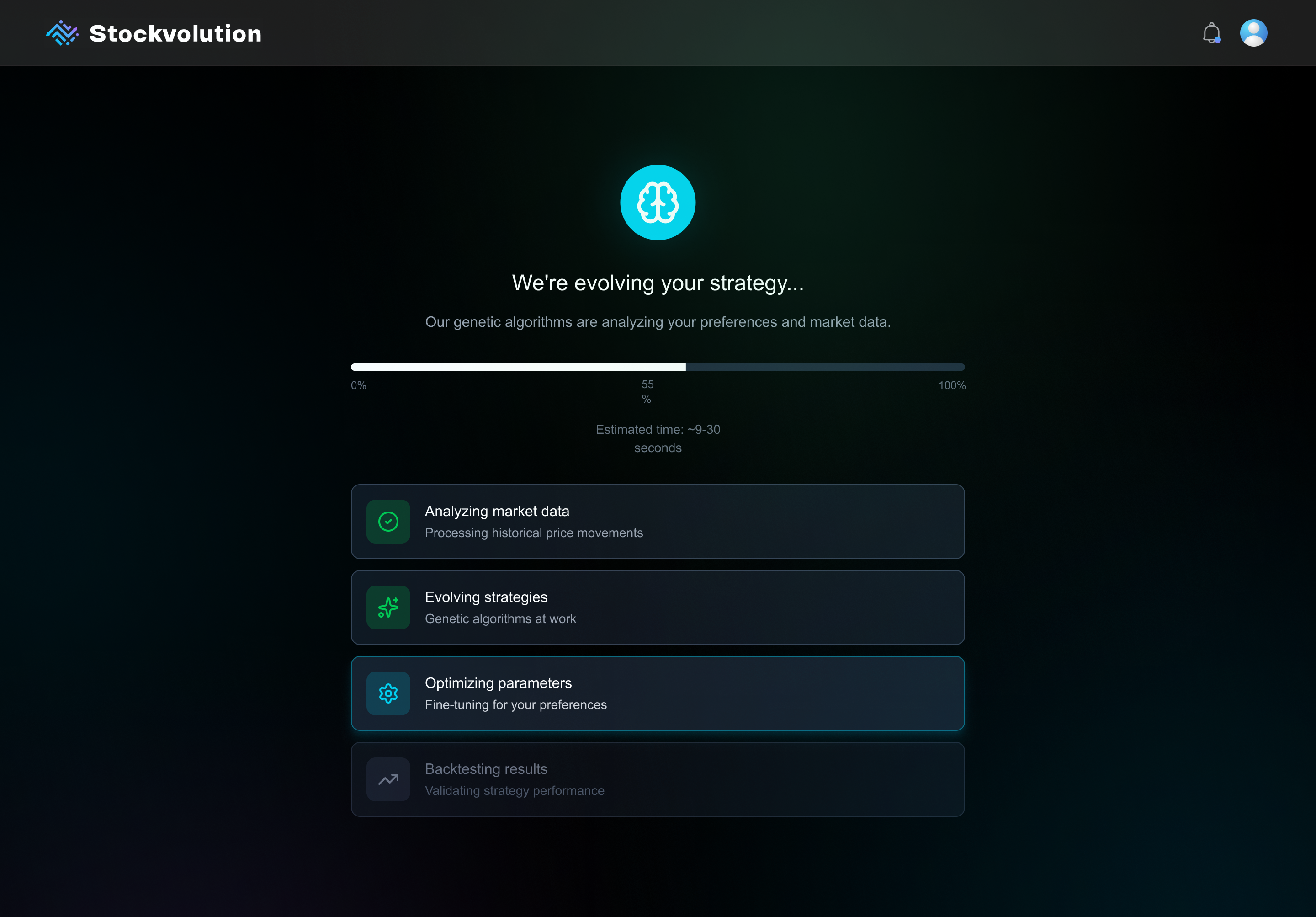
Strategy Creation (Loading State)
One of the UX challenges was the algorithm’s slow processing time. Instead of hiding it, the delay was turned into a transparent, engaging experience that built trust and anticipation.
- Micro-animations visualized real-time progress to maintain engagement
- Backend stages were surfaced to boost clarity and trust
- Built anticipation while reinforcing the algorithm’s depth
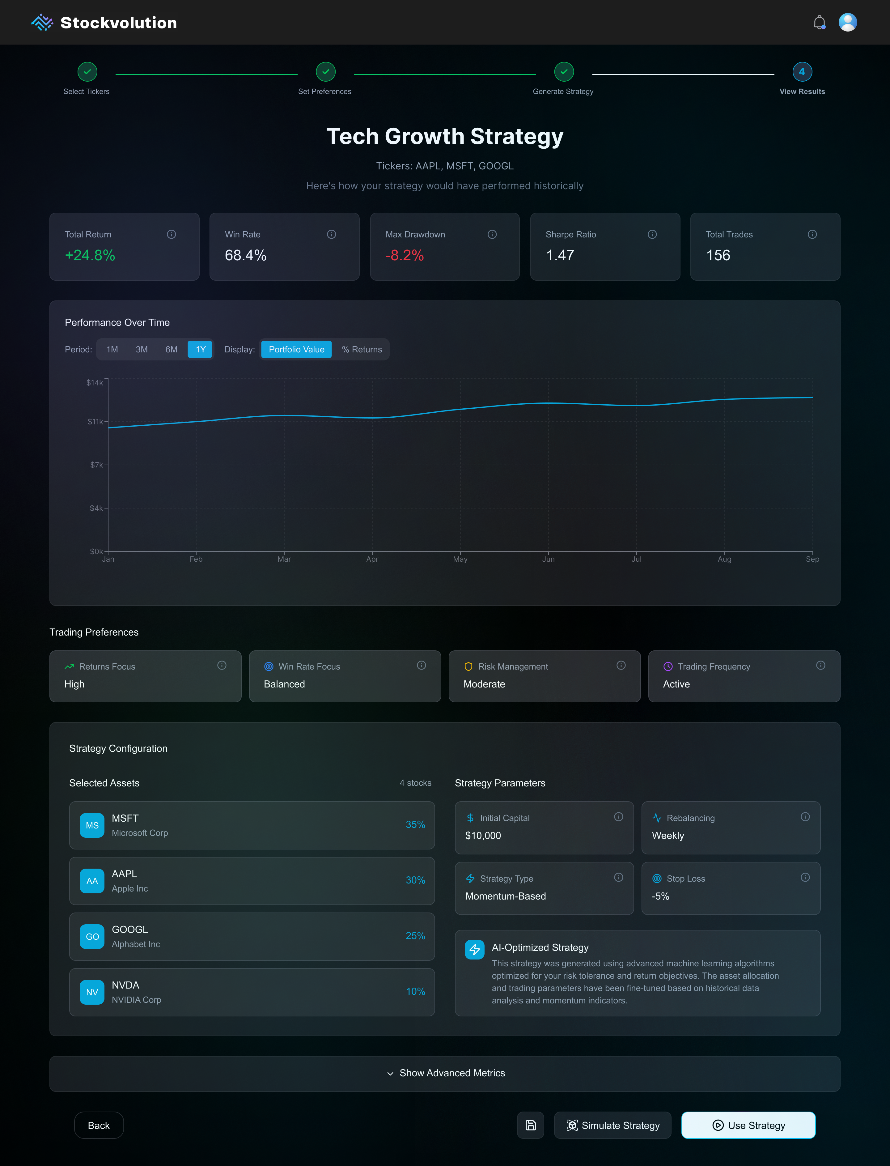
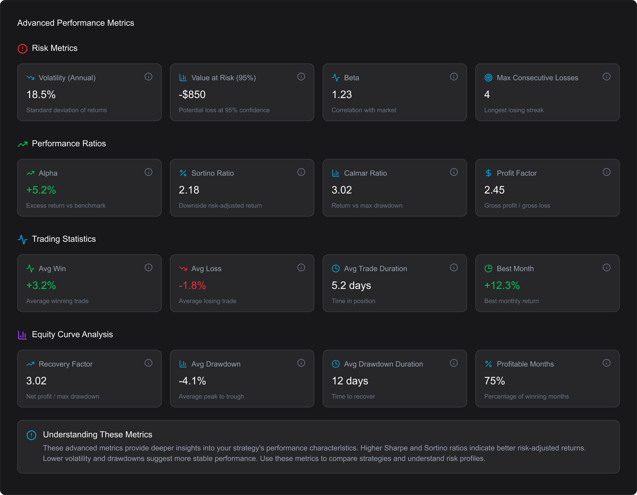
Strategy Results & Review
- Summary stats are placed front and center for quick decision-making.
- Hoverable info buttons on each card explain key metrics without cluttering the interface.
- An “Advanced Metrics” section can be expanded to reveal deeper insights for more experienced users.
- Clear call-to-actions let users either simulate safely or activate a strategy — reinforcing a test-before-you-trade mindset.
Takeaways
This project pushed me to balance speed, clarity, and collaboration under real constraints. Here are my biggest takeaways:
- Clarity comes first Before designing, I learned the importance of asking the right questions to truly understand the product, its users, and its logic.
- Designing for beginners shapes everything. Building trust through simplicity and guidance not only helps novices but improves usability for all.
- AI can accelerate, not replace.Used strategically, AI sped up our workflow and freed us to focus on high-value refinements.
- Tight designer–developer loops are invaluable. Iterating side by side with a clear issue-tracking workflow bridged the gap between design intent and implementation.
- Good UX is translation.Turning technical complexity into an accessible, human experience is where design adds its most value.
This wasn’t just about creating screens - it was about shaping an early-stage idea into a usable product, and doing it fast, without losing focus on the user.

